Animated music bars with CSS
My site is a place to learn and try new tech, so after seeing Lee Robinsons post on Using the Spotify API with Next.js this was definitely something I wanted to try out. The goal was to add a "Now playing" widget to the footer showing what I'm currently listening to on Spotify.
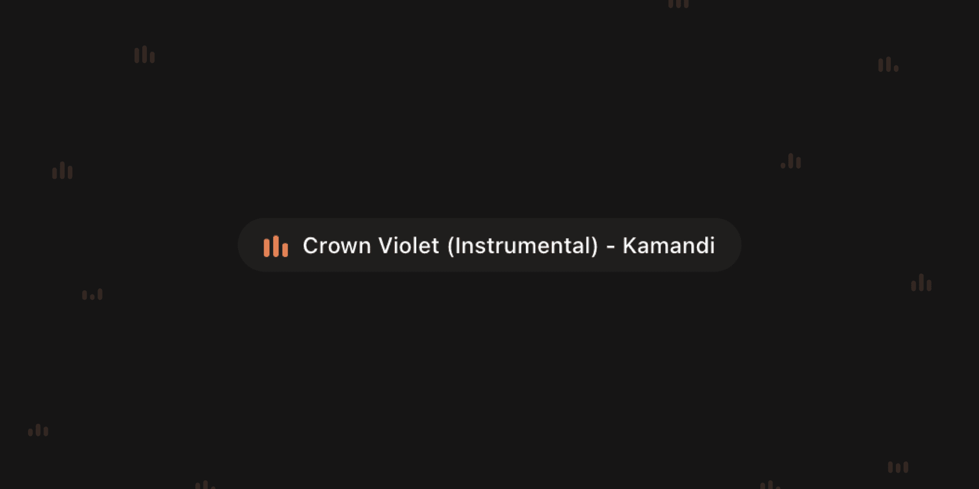
A few years back I purchased the first version of Apple Watch, and I remember that the "Now playing" complication had a very pleasant animation with "bars" jumping up and down. This tutorial shows how to create a similar animation perfect for visualizing music. This is what we're building: (psst, if I'm listening to music right now you can watch a live example in the footer…)
Let's get started
This animation is written in css modules with sass in a Next.js/Typescript project but can easily be adjusted to pure css by not using nesting & creating unique classes.
Let's start by creating a wrapper div that will contain our bars, then we'll add a span tag for every bar:
import styles from './nowplaying.module.scss'

<div className={styles.icon}>
  <span />
  <span />
  <span />
</div>
We'll add some containing styles to our wrapper element and style each bar:
.icon {
  position: relative;
  display: flex;
  justify-content: space-between;
  width: 13px;
  height: 13px;

  span {
    width: 3px;
    height: 100%;
    background-color: orange;
    border-radius: 3px;
    content: '';
  }
}
Which renders:
To make our bars jump we'll create a keyframe animation, transforming each bar's scaleY up and down indefinitely and apply it to our bars.
@keyframes bounce {
  10% {
    transform: scaleY(0.3); /* start by scaling to 30% */
  }

  30% {
    transform: scaleY(1); /* scale up to 100% */
  }

  60% {
    transform: scaleY(0.5); /* scale down to 50% */
  }

  80% {
    transform: scaleY(0.75); /* scale up to 75% */
  }

  100% {
    transform: scaleY(0.6); /* scale down to 60% */
  }
}

span {
  width: 3px;
  height: 100%;
  background-color: orange;
  border-radius: 3px;
  animation: bounce 2.2s ease infinite alternate;
  content: '';
}
The infinite property basically tells our animation to keep going forever, and alternate is the short-hand for animation-direction saying that the animation should be played forwards first, then backwards keeping our animation smooth.
We have a few problems though. First, the bars are scaling from the center instead of the bottom. We can solve this by adding a transform-origin of bottom:
span {
  width: 3px;
  height: 100%;
  background-color: orange;
  border-radius: 3px;
  transform-origin: bottom;
  animation: bounce 2.2s ease infinite alternate;
  content: '';
}
Now our bars are animating in height but aligned to the bottom! The last thing we need to do is change so that they are not animating at the same time. We want each bar to start animating at a different time so we'll reach for the animation-delay property. But we can't simply delay each bar, because then the animation would't look good the first few seconds. If we add a negative value to animation-delay, the animation will begin immediately but partway through its cycle. From MDN Docs:
For example, if you specify -1s as the animation delay time, the animation will begin immediately but will start 1 second into the animation sequence.
Let's add different animation-delays to our bars with the :nth-of-type() selector:
span {
  &:nth-of-type(2) {
    animation-delay: -2.2s; /* Start at the end of animation */
  }

  &:nth-of-type(3) {
    animation-delay: -3.7s; /* Start mid-way of return of animation */
  }
}
Voila! We now have a smooth working animation, perfect for building a music widget like the one on this website or similar! Check out the full source code on GitHub.